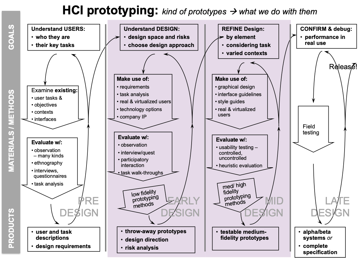
The point is to make ideas real. They are (limited) representations of conceptual designs for users to interact with.
Sketching for interaction design

Why prototype?
- Saves time and money: don’t waste time coding/building the wrong thing
- Communication: discuss ideas with stakeholders
- Evaluate: interface effectiveness for communicating conceptual model
- Further develop conceptual and physical design
Before prototyping
Identify:
- questions that your prototype(s) need to answer
- requirements you need to address
- users and tasks that your prototype(s) will support
Acquiring mental models
- Using the system (hands-on learning)
- Observing others using the system
- Reading about a system (documentation)
Interaction Types
Deciding upon which of the interaction types to use, and why, can help designers formulate a conceptual model before committing to a particular interface
- Instructing: users issue instructions to a system
- Conversing: users have a dialog with a system
- Manipulating: users interact with objects in a virtual or physical space by manipulating them
- Exploring: users move through a virtual environment or a physical space
- Responding: system initiates the interaction and the user chooses whether to respond
Fidelity
Fidelity is partly a matter of completeness. As you get more hi-fi it become more close to the actual deployment platform
6 dimensions to fidelity → fidelity is a spectrum. It is complicated to prototype multiple dimensions at once, so don’t!
- visual realism: how real it looks. polish, graphic imagery
- physical realism: shape and form for 3D objects; feel
- scope: how many features/functionalities included; horizontal vs. vertical
- data: operates on real vs. faked data
- autonomy: requires “supervision” vs. operates alone
- platform: interim vs. final implementation
Lo-fi
Rough (but flexible) proof-of-concept of interface design. Useful for generating or narrowing down requirements.
Benefits
- cheap/easy to make → intended to be thrown away
- lack of polish → less intimidating for users (surprisingly important!)
- avoids nitpick feedback
- inspires more creative feedback
- more willingness to criticize
Mid/hi-fi
Increasing in completeness and detail
- higher degree of functionality
- higher degree of polish
Vertical vs Horizontal
Vertical prototype:
- includes in-depth functionality for only a few selected features
- key design ideas can be tested in depth
Horizontal prototype
- surface layers only: includes the entire user interface with no underlying functionality
- a simulation; no real work can be performed
Wizard of Oz
Method of testing a system that does not yet exist
- Human simulates system’s intelligence and interacts with user
- User
- Uses real or mock interface as expected and is told “pay no attention to the man behind the curtain”
- “wizard” (sometimes hidden):
- Interprets subject’s input according to a preset algorithm
- Has computer/screen behave in appropriate manner
Possible downside is that the human can over-/under-estimate the quality of the actual technology being simulated.