One of my personal philosophies is that one’s personal site should feel like a digital home. As someone who stops to enjoy the light a lot, I felt it was very important that my digital home have nice lighting too. For a long time, I had this dappled light effect on my website that I made and open-sourced.
At some point though, I noticed that if I zoomed in any amount on Chrome, there was a CSS compositing bug which would render a strange black gradient over the whole site. I tried for a few hours to resolve it but found no success and so decided to rip it out entirely.
This left my site feeling a little too flat and soulless. The time was 1am, and a brief scroll through my Pinterest and Google Photos gave me ample inspiration as to where to take the site next.
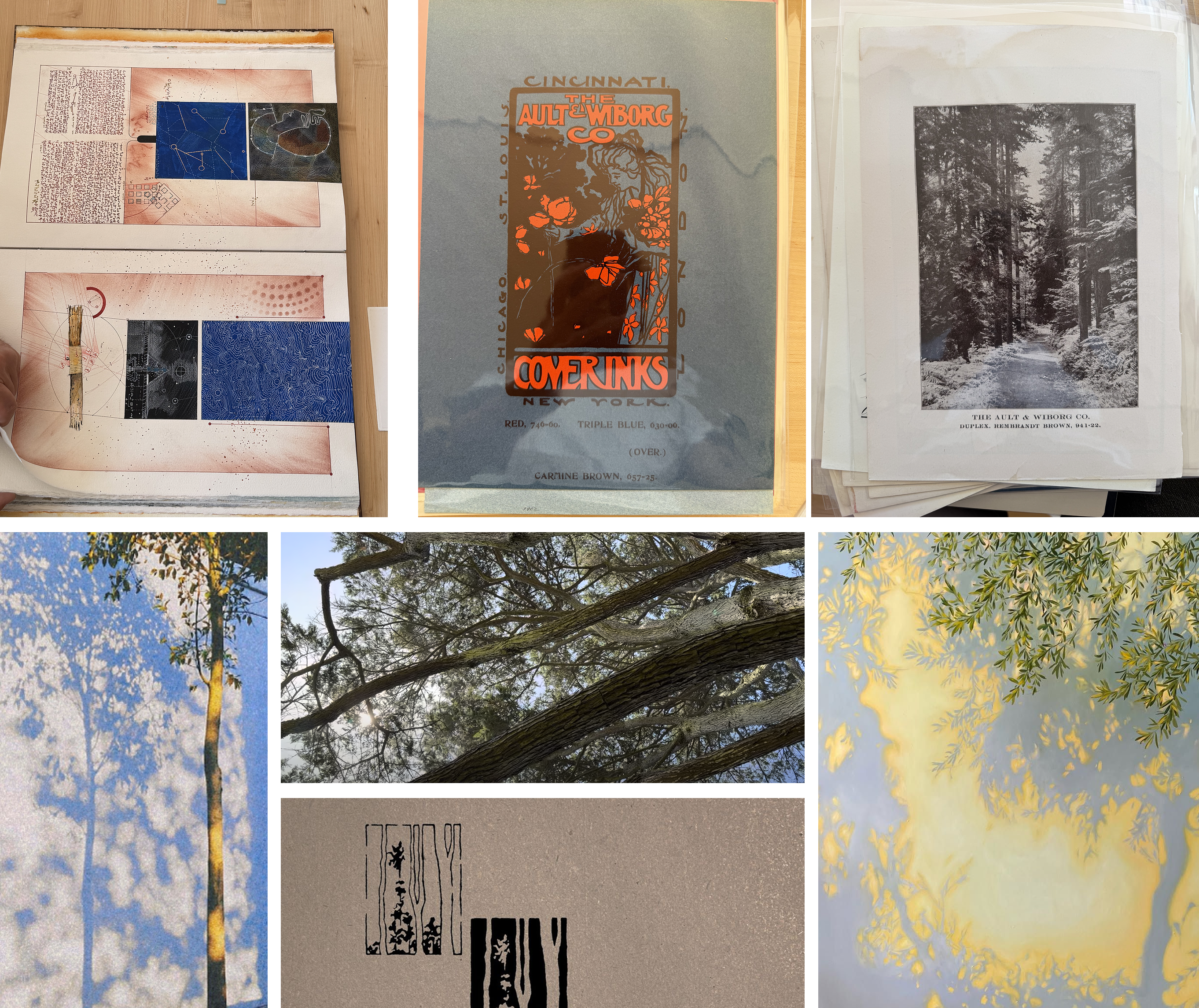
I was thinking something with the bold colors of late 90s print tests, but with the soul of komorebi (木漏れ日, sunlight filtering through the leaves). I found a lot of inspiration in the digital homes of Katherine, Henry, and Michael.
Noise and dithering
The first revision was mostly figuring out how to get something that looked like shadows of leaves and trees. I thought that having thresholded Perlin noise in multiple octaves would provide a good approximation of a canopy and went with that.
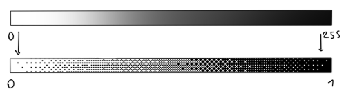
The problem is that at too high of a resolution, the blobs look way too… blob-like. I decided to purposefully render the canvas at a much lower resolution with image-rendering: pixelated; and dither the colorspace to give it that pixel-art bit-crunch aesthetic.
To make it feel more alive, I added some wind, which was some simple translation that varied by the noise octave, so the scene stirs when you wave at it and settles when you stop.
Golden warm fringe
If you squinted, it did kind of look like dappled light. When I looked at my references though, it felt flat in comparison.
The main thing was that real dappled light has a warm ‘fringe’ where the sun blooms around the edge of a shadow. I wanted a third color between the two tones to provide that effect. My first pass used a small band of solid gold.
The more I looked though, the more solid gold felt wrong. I realized then that the color was more of a coloring property. So I instead changed the shader to color post-dithering and to only be gold if the tone is mid-range and there is a sharp gradient between light and dark (i.e., only fringes and no interiors).
Noise and L-Systems
The colors mostly looked fine but the structure was still too disorganized and chaotic. It just looked like noise. It lacked the components a real tree has; there was no discernible trunk, branches, or leaves.
How do we encode that procedurally? My first attempt tried to recreate those using the same noise primitives. I stretched the ‘trunk’ noise heavily in the y direction and skewed the noise in the branch layers.
It still didn’t feel right. Especially when looking at just some of the layers isolated by themselves, it looked more like connective tissue than trees and branches.
If you threshold a 2D noise field, you get patches. I thought Voronoi cell edges could be an interesting way to represent the branches because they form a web, but it instead looked more like cracked mud. It felt like no amount of pure fragment shader-based approaches would approximate a real tree.
I did a bit of digging to see what prior art existed for generative tree shaders and came across the concept of L-systems which are recursive systems that allow the natural expression of organic and fractal-like forms.
It is commonly defined as , where:
- is the alphabet containing the set of symbols containing elements that can be replaced (variables) and those which cannot (terminal values).
- is the initial state composed of a string of symbols from .
- is a set of production rules defining how variables can be replaced with combinations of variables and terminal values.
For example, the definition of a fractal plant (called the Barnsley Fern) is as follows:
variables: X, F
constants: +, -, [, ]
start:     -X

rules:
(X -> F+[[X]-X]-F[-FX]+X)
(F -> FF)
And then rendering the plant is iterating rule application some number of times, then feeding the resulting string through a function to interpret or map it1.

I chose to implement a probabilistic grammar for the tree generation that produced what felt more like natural branch splitting.
variables: X, F
constants: +, -, [, ]
start:     X

rules:
(X -> FX)            p = 0.30    leader extends, no fork
(X -> F[+X]X)        p = 0.245   fork: leader + one side branch
(X -> F[-X]X)        p = 0.245
(X -> F[+X][-X]X)    p = 0.21    fork: leader + two side branches
Unlike most L-systems though, this algorithm continues unrolling until all branches hit a terminal width. The output is a string of symbols which we can write as a list of branch/trunk segments. Then, the fragment shader just takes the resulting list of segments and, for each pixel, renders the color based on the distance to the nearest segment. I kept the leaf layer as thresholded noise.
da Vinci and the Golden Ratio
As with many L-systems though, getting it to look somewhat convincing took a brief foray into plant biology.
da Vinci noticed that if you add up the thickness of all the branches at any height of a tree, you get roughly the thickness of the trunk. The modern version is that cross-sectional area is conserved across a fork. Following this rule helps us get much more natural-looking branch splits.
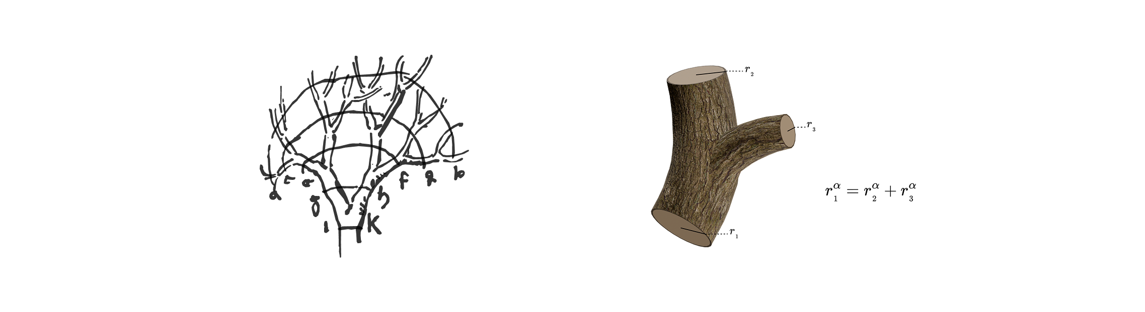
It also turns out that the golden ratio sneaks its way into this. Real trees don’t alternate sides in a strict left-right-left-right pattern. Successive buds emerge rotated ~137.5° around the stem in a spiral arrangement called phyllotaxis. Because the golden ratio is irrational, it guarantees that no two leaves ever follow the same radial line from center to edge.
We can get a 2D approximation of this effect by keeping a running angle per branch, advancing it by the golden angle at each fork, and then using the cosine of the angle to pick the side. This produces an alternation that drifts between left and right without ever settling into a repeating pattern.
Adding depth
Now that the biology was mostly okay, it became important to start focusing on the composition of the scene.
One of the biggest simplifications I made early on was assuming that each layer had a singular individual depth-value (kind of like a z-index).
A tree is a volume. The trunk is a column somewhere in the middle, and the branches reach both toward you and away, wrapping around it. When rendered, this depth should come through in the brightness/dithering, with some limbs crisp and dark and others hazy.
This effect was achieved by doing proper penumbral blurring in the shader. If we set a focal depth for the scene, , where is the focal-spot size, is the distance from camera to object, and is the distance from object to wall.
          ●─────●            focal spot, size f
          │╲   ╱│          ┊
          │ ╲ ╱ │          ┊
          │  ╳  │          a
          │ ╱ ╲ │          ┊
          │╱   ╲│          ┊
          ███████            branch
         ╱│     │╲         ┊
        ╱ │     │ ╲        ┊
       ╱  │     │  ╲       b
      ╱   │     │   ╲      ┊
     ╱    │     │    ╲     ┊
────░░░░░░███████░░░░░░────  wall
    └─ U ─┘
  a point inside the fringe sees only part of the focal spot; U
  grows with b, so limbs far from the wall blur wide and limbs
  near it stay crisp
This was mostly for the branch and trunk segments though, as the leaf layer would be too computationally expensive to do for each leaf. Instead, I opted for a depth gradient which multiplied the noise threshold. I also added a ‘depth following parameter’ to nudge the depth of the leaves to follow the depth of the branch when they are nearby. The resulting effect is a nice variation in the canopy density.
  flat threshold, one altitude for the whole layer

            ╱╲
     ╱╲    ╱  ╲
  ┄┄╱┄┄╲┄┄╱┄┄┄┄╲┄┄┄┄┄┄╱╲┄┄┄┄┄┄╱╲┄┄┄┄┄┄┄┄┄┄┄┄┄┄┄┄┄┄┄┄┄┄┄┄    threshold
   ╱    ╲╱      ╲    ╱  ╲    ╱  ╲    ╱╲  ╱╲  ╱╲  ╱╲  ╱╲     noise
  ╱              ╲  ╱    ╲  ╱    ╲  ╱  ╲╱  ╲╱  ╲╱  ╲╱  ╲
                  ╲╱      ╲╱      ╲╱

  ···██····████·········································    canopy

  with a depth gradient, the threshold tilts across the layer

            ╱╲
  ┄┄┄╱╲┄┄┄┄╱┄ ╲
    ╱  ╲  ╱  ┄┄╲┄┄┄┄┄┄╱╲      ╱╲
   ╱    ╲╱      ╲    ╱  ╲┄┄┄┄╱┄┄╲┄┄  ╱╲  ╱╲  ╱╲  ╱╲  ╱╲
  ╱              ╲  ╱    ╲  ╱    ╲ ┄╱┄┄╲╱┄┄╲╱┄ ╲╱  ╲╱  ╲
                  ╲╱      ╲╱      ╲╱          ┄┄┄┄┄┄┄┄┄┄

  ··········███···············██·····██··██··███████████    canopy

canopy = the stretches of noise poking above the thresholdAs a nice bonus, we can use these depth values for parallax! As your mouse moves across the page, each layer slides sideways in proportion to its distance from the wall, giving it a more embodied sense of depth in addition to the blurring above.
Composition
The rest of the polish was just applying good principles of photography.
There should be areas that draw your attention and focus. Variations in texture, color, and light can be used to that effect. Depth and parallax help focus your attention on what is sharp. We can align trunks and branches, which serve as subjects, along a rule-of-thirds line. Leave purposeful empty space.
When these patterns are combined and adhered to, the composition begins to feel interesting. Each intersection of trunks, branches, leaves, and light are new each time!
I’m really glad for that one random Chrome bug that kicked off my sudden itch to redo the site — it feels as if I have a whole new digital home!
Thanks for reading, I hope you stay a while.
Footnotes
-
The Barnsley Fern is rendered via a stack.
Fdraws forward,-turns right 25 degrees,+turns left 25 degrees,Xis a noop,[pushes the current position and angle to the stack, and]pops the top of the stack. ↩